Using InDeisgn, we have been using a template to create a CD, using photographs, fonts and different style of layouts.
To stick to the professional conventions of a usual CD, I added the company's piracy policy around the edge of the CD, using the oval tool, then adding text in the same shape.
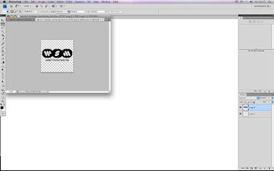
Using Photoshop, I added another layer to the image, enabling me to delete the background and make the logo not have a white background, which would ruin the image on the CD when I added it.
I feel that the logo's of the various CD sponsoring companies create a professional cover and follow the usual conventions of a CD.
To make my digipack look professional and eye catching, I downloaded fonts online and installed them on to InDesign.
The background that I had chosen for the back cover of my CD made it difficult the read the titles, I overcame this problem by putting a white background behind the font, making the titles clear to read.
I am quite please with my first draft of a digipack, as I feel that as well as following the usual conventions of a CD cover, it also has its own unique elements.


No comments:
Post a Comment