Wednesday, 30 November 2011

Practicing 'Move' Sequence

Using the Canon 7D and filming a few clips around school, I've been practising recreating something similar to the 'Move' sequence.
HOWEVER... out of ten different locations, only two of them allowed me to create a convincing continuous walk. This has taught me that, in future, I will need to keep the actress beginning and ending at the same place each time, as well as insuring that they are in the exact middle of the shot, and start walking on the same foot, with the same arms each time!


2ND ATTEMPT.

Making sure that the person in the shot began walking in the exact same place allowed me to add a few more locations.

Update: Although I like this idea and think it would work well, I feel that within the conventions of an 'indie' music video, with a relaxed pace and atmosphere, this would draw away from the target audiences expectations and possible effect how convincing my music video was in my chosen genre. 

Sunday, 20 November 2011

Target Audience

In order to research into potential target audience's for my music video, I created a survey on www.surveymonkey.com to collect informations from potential viewers.
This will inform me of the conventions that may need to be included in my music video, in order to to portray it as a professional video.


http://www.surveymonkey.com/s/XVPNVQR


Results: 


 Overall, it is clear what people expect from an indie music video; the usual conventions consist of locations such a beaches, forests and sand dunes, generally with no narrative though occasionally an easy to follow story. Conventions also include casual, neutral clothing and a relaxed atmosphere. 

This is Loty, she is 18 and I feel that she represents the perfect target audience for my music video. She likes acoustic artists such as  Ben Howard, Bombay Bicycle Club and Lucy Rose. She shops in shops such as Topshop and urban outfitters and spends her free time listening to music, playing guitar and going to the beach with her friends. 


This is a short video interview with Loty about the conventions she expects in an indie music magazine:


Equipment

Using all of the equipment available, I have created a short film practicing with the Canon 7D, the crane, the dolly and the usual tripod. Loty has also filmed me using the equipment.

http://youtu.be/TBTAMMGIhVg


Thursday, 17 November 2011

RICK IS A GREAT GUY

http://vimeo.com/27246366

Rick Mereki:
'3 guys, 44 days, 11 countries, 18 flights, 38 thousand miles, an exploding volcano, 2 cameras and almost a terabyte of footage... all to turn 3 ambitious linear concepts based on movement, learning and food ....into 3 beautiful and hopefully compelling short films.....'


Although I love all 3 short films, 'Move' is my favourite! I would love to use a sequence similar to the film, in a section of my music video. This would entail many locations and very fast pace cuts, but I feel that the final product would be worth it, it is so interesting and would be a very cool time filler.

Wednesday, 2 November 2011

iCal


Using the iCal app on my macbook, I was able to create a time plan of the work that needed completing in the month of October. Keeping deadlines and lesson plans in a calendar like this allows me to keep good time management and allow plenty of time for things to get done.


Photoshop Tutorial

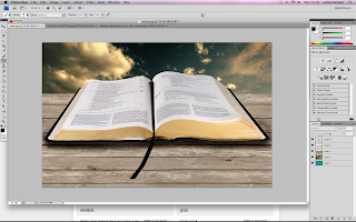
Using a Photoshop tutorial, I created the following:

Using Photoshop CS4, I began to follow a tutorial to create a 3D book.
Using the magnetic lasso, I was able to remove the background originally around the book itself, and replace it with the cloudy background, scaling it to fit the image.


Using the quick selection tool, I was able to select just the pages section of the book and delete this.
I was then able to put the grassy imagine in this place, and warp it to make it look more realistic. After this, I created a new layer and used a large brush to add shadows; starting with it black, then lowering the opacity and blending to make them more realistic.
After selecting the section of road that I needed (using the magnetic lasso tool), I copied and pasted it into the book image. Using the warp and scale tools, I was able to add depth to the image and make the road look more realistic. I also added shadows using a large black brush, highlights and burns tool, in the right places to match the background.
After cropping trees, and editing the layer and removing any remaining white, I was able to add them to the book and make them look in place by flipping them, and adding various shadows.
Again, using the burns tool and highlighting and using the large brush, I have attempted to make the image look more realistic.


This photoshop tutorial has taught me the many options and effects available, hopefully allowing me to create more interesting and eye catching digipacks and posters.

 Messing around on photoshop, I created a Hockney style imagine of Elli Goulding... If I were to improve this cover then I feel that it would contribute to an interesting digipack. 

Monday, 31 October 2011

Animatic + Feedback

Using the drawings from my storyboard, I was able to compile my animatic; demonstrating different camera angles and locations that I would like to use in my music video.


http://www.youtube.com/watch?v=R3ezwm5xXus&feature=youtu.be


 feedback on my animatic from classmates watching on the big screen: 

- one: 'I thought that shots were appropriate and interesting, however I feel that there could be a bigger variety of locations and camera angles, for example, a couple more long shots.'
- two: 'Good, meets indie conventions, try and edit the music video so that shots cut on the beat of the song.'
- three: 'Maybe less costume changes, good drawings and locations.'
- four: 'interesting camera angles, use more location and filler shots though.'
- five: 'follows conventions well! good locations, use more panning shots.... '

^ class giving feeback

From my feedback I have learned that in my music video, I need to insure that I cut the shots on the beat, as well as including a huge variety of shots and multiple camera angles. I will also need to use more movement in my shots, for example by using the dolly and the crane! (Though I suppose this is difficult to show through drawings!)

Storyboarding

Hand drawn pictures show the camera angles, locations and style of shots that I will be including in my music video.

This long shot of Lisa on a risen surface above the forest will allow opportunity of good depth of field shots, as well as allowing the viewer to absorb the background as well as the lip syncing and body language.


Auditions

For my auditions, I had three girls come into the studio and mime the words to the same song.
After my auditions, I have chosen Lisa Day as my final actress, as I feel that her audition was the most... entertaining, I also feel that she will be reliable to turn up to scheduled filming times and allow me the achieve the camera angles that I want by climbing up trees and fun things like that. 


^ this is lisa!
I filmed this audition using the Canon 7d on the dolly, and also hand held, I then edited it in Final Cut Pro. This allowed me to come become used the equipment that I would be using for my music video. 

Poster 4

After finding an interesting image, I opened this image in photoshop and began to experiment with effects, to see what looked interesting and professional.


Modifying the image and selecting various settings such as colour brush, or pencil effect etc, I highlighted different sections of the image and played around with it, until I was happy with the product.


I then exported the image and uploaded it into InDesign. I began to add text and image conventions to make the product look professional.
I am quite happy with the final product of this draft Ellie Goulding poster, as the contrast of textures and effects, create an interesting overall composition. The usual text and conventions, as well as the image of the album cover, keep the product looking professional, but the image keeps it interesting.

Poster 3

Following are a few screengrabs of me creating a Florence and the Machine poster.


To be totally honest, overall, I do not like this! Although it has the usual conventions of a music poster, I feel that the colour scheme and photograph are not interesting enough to catch the attention of the viewer. However, I do feel that the downloaded fonts look quite interesting. 

Poster 2


Just a couple of screen grabs demonstrating how I removed the white background of the HMV conventions, to make my product look cleaner and more professional.


I quite like this poster as I feel that the black and white photo, highlighted by using coloured text, creates a nice composition. I feel that it has a relaxed feel, following the artists style, but is still eye catching enough to be a successful poster. I also feel that using the usual HMV poster conventions helps make the product look more professional.