I have created a short video, answering this evaluation question: http://www.youtube.com/watch?v=KpR6ueTDjZA&feature=youtu.be
Script from video:
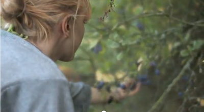
"I have compared a few clips from my music video to a Lucy Rose video 'middle of the bed'. The similar props, actresses and locations demonstrate the similarites that lie between the videos, proving the conventions of my own music video. As well as this, I feel that it highlights the differences; such as the light leaks and the more rural locations, challenging the usual conventions my chosen genre.
I choose Lisa as my actress as her general look, clothing style and hair style, fits with the usual conventions of an 'indie' singer. Her blond wavy hair and carefree attitude, enabled clips similar to a typical indie music video.
Locations such as sand dunes and beaches are similar to the Ben Howard video of old pine. This allows my video to stick to conventions of 'indie' media products by having a location that the target audience can relate to. It also allows shots to explore the location as part of the videos narrative."
Applying Andrew Goodwins Theory:
1. The locations of nature, outdoors and the beach, follow the usual conventions and expectation of an acoustic, indie music video! Appealing to the expected conventions of the target audience.
2. As the lyrics 'moving on' are in the song, I have placed my actress on her own, reflecting upon her situation. As well as this she is 'rolling on' whilst on a bike and 'wears out feet' cuts to a shot of the actresses shoes.
3. On a particually upbeat section on the song, I have placed a clip of Lisa laughing and blowing bubbles.
4. The demands of the record label will include the need for lots of close ups of the artists and the artist may develop motifs which reoccur across their work (a visual style)
5. There is frequently reference to notion of looking (screens within screens, telescopes etc and particularly voyeuristic treatment of the female body)
Conventional aspects of my digipack include the following:
Conventional aspects of my digipack include the following:
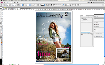
Conventional aspects of my poster are as follows:
How effective is the combination of your main product and ancillary texts?
What have you learned from your audience feedback?
I have created a short video answering the video side of this question...
http://www.youtube.com/watch?v=-5wfLpmJ2Eg&feature=youtu.be
Before I began creating my music video, as part of the planning stage, I used www.surveymonkey.com, in order to collect information of typical expectations that my audience had of indie music video The results informed me of what my audience expected; such as costumes and locations; such as plain clothing, consisting of jeans and plain t shirts. Most people also expected beach/natural locations; I stuck to both of these conventions in order to stick to my chosen genre and appeal to my chosen target audience.
After this, I began to create my anamatic from a hand drawn storyboard, the use of feedback from my class told me that although they liked the general concept of my music video, they would like to see a bit more movement; using the dolly.
After Privately uploading my music video to youtube and gaining feedback from my class members, feedback taught me that I needed to make my narrative more obvious and have a little more movement in my video. This lead me to go out again and shoot about another minutes worth of footage; weaving this into my music video a llowed the narrative to be alot more obvious and improved the whole thing overall.
As I uploaded my final music video, I shared the link on social networking sites such as twitter and facebook, allowing to gain comments and feedback on what my target audience thought of my music video. As well as this, 'likes' and comments on the youtube video link informed me of what other people were thinking. Overall the feedback was very positive, with people particularly mentioning that they liked the location, as well the effects such as the light leaks and the dust scratches.
The majority of the feedback that I gained for my ancillary tasks came from other members of my media class, after it was projected on to the big screen:
'Love the contrasting colours of the digipack, very convincing'
'Everything is easy to read but still interesting, cooooool!'
'Nice locations and photography- works will with video'
'Works well, could of used more brushes on the cover maybe'
'very conventional convincing hmv poster'
Together with feedback from social networking such as Facebook; overall I am very happy with my feedback, which is mainly positive, only mentioning that a few more brushes could have been used to improve the digipack.
OVERALL, I feel that through the use of survey monkey, social networking as well as peer feedback has enabled to develop my products over the course of my coursework, by learning typical aspects expected by my target audience and improving on these factors! :)
How did you use media technologies in the construction and research, planning and evaluation stages?
I have created a short film answering this question:
http://www.youtube.com/watch?v=o6Sycqy4Mag&feature=youtu.be
SCRIPT from film:
"For my research and planning, I began by using iCal to plan my time out, arranging how long I would spend analyzing each research video. It allowed me to manage my time well by sticking to deadlines, arranging filming times with the rest of my class and planning out how long each digipack or poster would take to create.
Using safari on the Mac G5, I looked at music videos of a similar genre to the one that I was going to choose; indie. I logged on to youtube and vimeo and took screen grabs, (using cmd shift, 4) of camera angles, shots and locations that I liked, and might use a similar idea for.
Using my online blog, I uploaded my screen grabs and anayzed the photos. This is a screenr of my blogger homepage; consisting of my published posts. I also used the scanner to scan in my hand drawn storyboard.
For my construction,
I began practicing digipacks and posters on InDesign, importing photographs that I had taken, and adding conventions and texts to make them look like a professional media product. I also used photoshop to edit my images and delete the white backgrounds off typical conventions. Here are some screen grabs of my creating my products.
For my actual filming, I used the canon 7d, as well as the tripod and dolly. This high end equipment allowed many interesting shots, using depth of field etc.
For constructing my main music video, I first compressed my footage on compressor. After this, I imported my footage into Final Cut Pro, where I edited it together, as well as overlaying light leaks and other effects.
Using After Effects, I have able to add in the text at the start of the song; consisting of the artists name, album name and song.
Websites such as 1001fonts.com and brusheezy.com allowed my to download fonts and brushes. Installing and including these in my ancillary tasks allowed me to create professional, interesting media products.
For my evaluation, I used online programs such as Survey Monkey- in order to collect research and collect feedback. As well as this, i used iMovie to create short films of my progress, as well as social networking such us Facebook, Twitter, and again YouTube, to share my film and gain comments."


