In order to create my poster and digipacks I had to take photographs of my actress in similar locations to that of my video. I held two different photo-shoots, one at the same time as filming, in the same locations and costumes, and another along the sand dunes in a range of outfits; though still sticking to the conventions of the acoustic/indie genre. These photos are shown in the following contact sheets:
Although I prefer the photo shoot that I held on a different day to shooting my footage, as the light is better and therefore creates a more interesting composition, the following contact sheets also reflect a few photos which atmosphere could contrast well to the sun and brightness, with a windy, darker atmosphere. These also stick more the music video/digipacks conventions by maintaining the locations throughout the products.
Using a digipack template and CD cover template, I was able to begin creating my digipack on InDesign. Using tools such as the 'type on path tool' I was able to add text around the outside of my CD and create a professional looking product.
As I felt that my main cover photo was slightly boring... I began editing it in photoshop.
In order to put a back ground underneath my CD, I had to export the CD cover as jpeg file, upload it onto photoshop, add a new layer and delete the white background, and then export it as a PNG file... I feel that this aspect makes my product look more professional that a simple white background.
On the website www.brusheezy.com, I was able to download brushes that I could use on photoshop to add to my photographs in order for them to look more professional and interesting. Using them I was able to create simple backgrounds out of texts, maps and other cool brushes.
^ an example of using brushes on my images to create an interesting effect to put them in my booklet.
Again using photoshop I was able to delete white backgrounds of conventions such as production company logos to maintain a professional front on my product.
As well as brushes, the use of downloading and installing fonts from the internet allowed me to improve the quality of my media product.
As well as brushes, the use of downloading and installing fonts from the internet allowed me to improve the quality of my media product.
Although I feel that the brushes on the backgrounds look kind of cool, I feel that it looks a little 'media student'y and therefore want to use a photograph in order to improve the quality.
Having changed the backgrounds to photographs I feel that my product looks much more interesting. The contrast between the opposing blues and yellows on opposite sides of the digipack, allows it to be eye catching and engaging. The message from the artist also allows the audience to relate by making them feel connected and part of the experience of the music.
FINAL DIGIPACK ^
POSTER
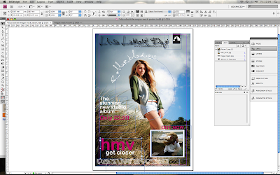
Again, using InDesign, I added in photoshopped conventions and aspects of a conventional HMV poster using downloaded fonts and logos, to photographs similar to those taken for my digipack. The copy right text is also another aspect that contributes to the conventional poster.
^ conventional HMV font
^ Warner brothers and WSM logos
Using photoshop and InDesign, I was also able to create a draft 'booklet' for my digipack; this would consist of photography of my actress, as well as lyrics from the album of the song and notes from the 'artist.'


No comments:
Post a Comment