Monday, 31 October 2011

Poster 4

After finding an interesting image, I opened this image in photoshop and began to experiment with effects, to see what looked interesting and professional.


Modifying the image and selecting various settings such as colour brush, or pencil effect etc, I highlighted different sections of the image and played around with it, until I was happy with the product.


I then exported the image and uploaded it into InDesign. I began to add text and image conventions to make the product look professional.
I am quite happy with the final product of this draft Ellie Goulding poster, as the contrast of textures and effects, create an interesting overall composition. The usual text and conventions, as well as the image of the album cover, keep the product looking professional, but the image keeps it interesting.

Poster 3

Following are a few screengrabs of me creating a Florence and the Machine poster.


To be totally honest, overall, I do not like this! Although it has the usual conventions of a music poster, I feel that the colour scheme and photograph are not interesting enough to catch the attention of the viewer. However, I do feel that the downloaded fonts look quite interesting. 

Poster 2


Just a couple of screen grabs demonstrating how I removed the white background of the HMV conventions, to make my product look cleaner and more professional.


I quite like this poster as I feel that the black and white photo, highlighted by using coloured text, creates a nice composition. I feel that it has a relaxed feel, following the artists style, but is still eye catching enough to be a successful poster. I also feel that using the usual HMV poster conventions helps make the product look more professional. 

Poster 1

Using Indesign, I created an Ellie Goulding poster.
I downloaded fonts, used photoshop to remove the white backgrounds on conventions to make my product look professional, and added the album cover to advertise the product well.


I have added the tour dates to the poster to add more text and make the product look more busy. 
I quite like this poster due to the simple colour scheme and poster conventions, I also think that the photograph makes a huge difference to the poster, proving that good photography is essential to make an eye catching poster. 

Friday, 21 October 2011

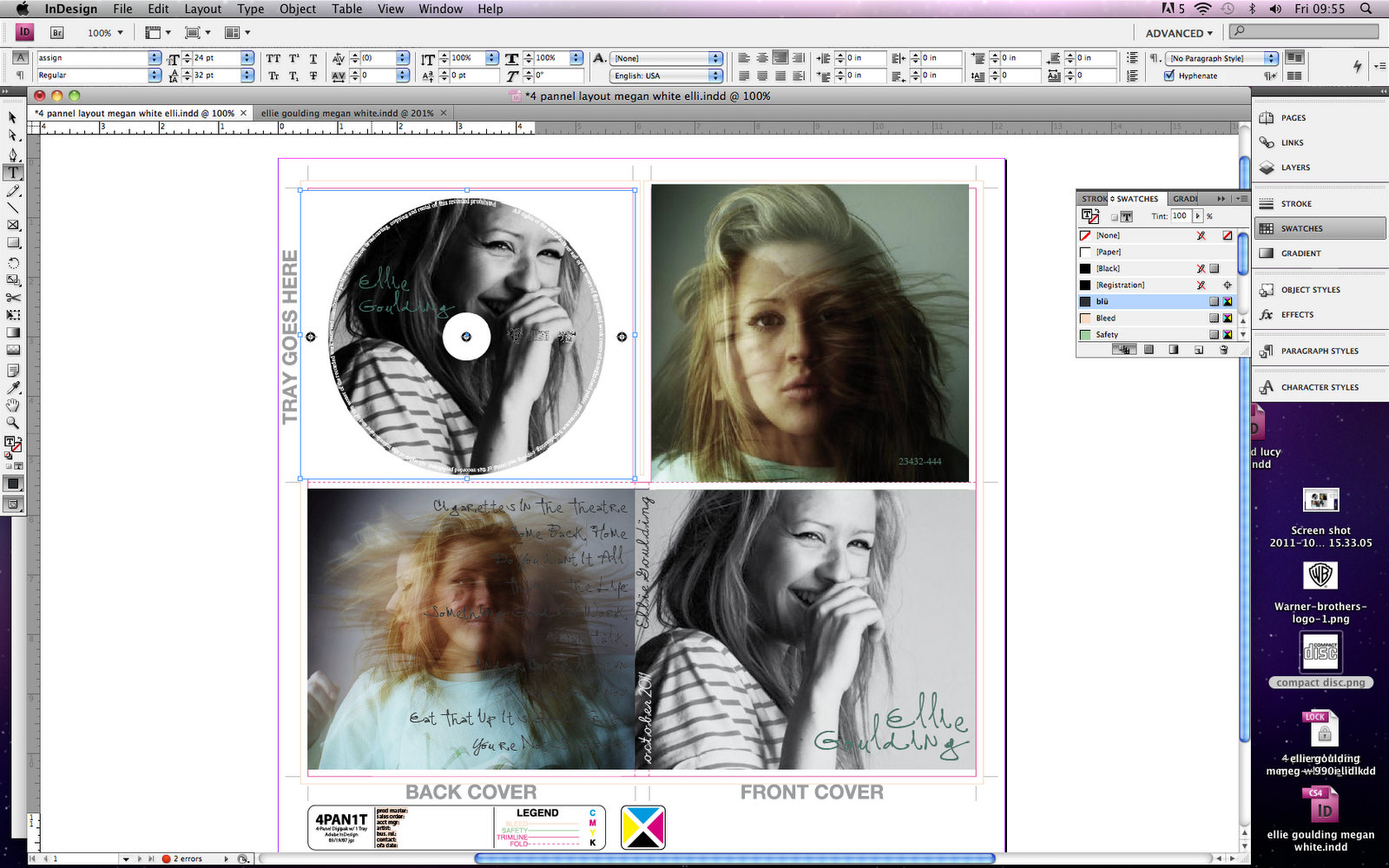
Draft Digipaks on InDesign 4

Using a few really interesting photos which I found on a social networking blogger www.tumblr.com, I put together another draft Digipack.

I feel that the coloured text over the black and white photo looks subtle and interesting. 
I also like the combination of black + white photographs, as well as the coloured, as it keeps the digipack diverse and interesting.
Although I feel that the text (song titles) over the portrait photograph is a little distracting, overall, I like this digipack. The photographs and usual conventions work well together and create a interesting Digipack. 

Monday, 17 October 2011

Draft Digipaks on InDesign 3

Lucy Rose is the artist, who's song I potentially may use for my music video, because of this reason, I decided to make a digipack using photographs of her. Because she is a fairly new artists, it was difficult to find photographs of her, however I decided to use a brightly coloured mixture of portraits.


To be completely honest, I dont really like the final product of this digipack, the bright colours don't really suit the genre that I have chosen as well as I thought they would.

Tuesday, 11 October 2011

Draft Digipaks on InDesign 2

 Using my own photographs of my potential actress, as well as photos found on the internet, I created my second draft digipack in In Design.
Using photographs that I had taken in the studio at school, of Lisa, I began to create another draft in In Design. Again, I downloaded fonts and used special tools to create the desired look.


As before, I used photoshop to clear the background of the various companies logos.


To stick to the usual conventions of a digipack, I added barcodes, dates and various other copyright numbers and descriptions. I feel that this gives the product a more professional appearance.


Although I prefer the previous digipack that I created, I feel that the product was quite successful due to the grey and blue colour scheme, usual CD conventions (such as the barcode), and the interesting images used. In future, I would prefer my digipacks to be more coloured and eye catching. 

Sunday, 9 October 2011

Possible Actors/Actresses + Locations + Costumes + Props

 This is Lisa. I have chosen to audition her for my music video as I feel that her image suits the acoustic music genre that I have chosen for my music video. She is confident in front of the camera and I feel that she will be reliable to film when I need her too!


Here is a crosslink to my auditions post.... in which Lisa features: 


Locations:
For my location, I am going to use St Ouens beach. (as well as many other short clips of other locations)
Here are screen grabs from my locations video (http://meganwhitemedia.blogspot.com/2012/02/location-footage-more-light-leaks.html). I have chosen this location as I feel that it suits well with the conventions of an acoustic/indie video; as well as this, the lighting is AMAZING and will allow my footage to look much more professional.


The beach and sand dune locations, follow the usual conventions of an indie/acoustic video, therefore allowing my video to fit well in this genre. 


Costumes:
For the costumes of my music video; my idea is to have very simple and casual clothes. Similar to that of Lucy Rose in her video 'Middle of Bed'; http://www.youtube.com/watch?v=adBPg8Zdp2g . After gaining feedback on expected conventions of an indie music video; I have chosen a suitable outfit.
It will consist of plain dark jeans, that finish at the ankle, and a variety of white logo T shirts; creating a simple outfit, sticking to the conventions of an 'indie' music video.

On www.polyvore.com I was able to create a collage of the kind of outfit that my actress will wear:


The neutral colours allow the clothing choice to stick with the conventional relaxed atmosphere of an indie music video.


Props:
The main props in my music video, will consist of a camera, ice cream and bicycle.

 The use of an ice cream allows the beachy theme to be dominant, as my actress will purchase one as one of my shots, the indie beachy vibe will be emphasised by this.

The use of the bicycle will allow me to capture some interesting shots using the dolly; adding some movement and again, sticking to the easy going atmosphere.
The old fashioned camera was a late addition to my music video, but the concept allowed a photographer to be added to the narrative, adding interesting shots to my music video, allows shows 'through the lens'!  

Initial Ideas

Lucy Rose - Night Bus
And you see trouble in her eyes
And you've noticed, but only realized
It's not fading, however hard you try
'cause it's built in her for all her life

I'm not alone
She said, "I'm not alone."

And she takes the night bus home
She's not phased by the darkness in her soul
And you barely catch a glimpse of her
'cause she's wrapped tightly, hiding in her clothes

I'm not alone
She said "I'm not alone."

And they're strangers, and they're walking my way
and I'm talking to myself
Strangers, and they're walking my way
and I'm talking to myself
And they're strangers, and they're walking my way
and I'm talking to myself
Strangers, and they're walking my way
and I'm talking to myself

She said "I'm not alone."


http://www.youtube.com/watch?v=Aei31Nj_pdA


I think that this could be an interesting song to make a music video to, as the acoustic sounds allows a relaxed atmosphere. The ideal location would be a beach, woods or sandunes as it suits the usual conventions of a music video in this genre.

OR

http://www.youtube.com/watch?v=HO1OV5B_JDw

Video Games by Lana Del Ray

Swinging in the backyardPull up in your fast carWhistling my name
Open up a beerAnd you say get over hereAnd play a video game
I'm in his favorite sun dressWatching me get undressedTake that body downtown
I say you the bestestLean in for a big kissPut his favorite perfume on
Go play a video game
It's you, it's you, it's all for youEverything I doI tell you all the timeHeaven is a place on earth with youTell me all the things you want to doI heard that you like the bad girlsHoney, is that true?It's better than I ever even knewThey say that the world was built for twoOnly worth living if somebody is loving youBaby now you do
Singing in the old barsSwinging with the old starsLiving for the fame
Kissing in the blue darkPlaying pool and wild dartsVideo games
He holds me in his big armsDrunk and I am seeing starsThis is all I think of
Watching all our friends fallIn and out of Old Paul'sThis is my idea of funPlaying video games
It's you, it's you, it's all for youEverything I doI tell you all the timeHeaven is a place on earth with youTell me all the things you want to doI heard that you like the bad girlsHoney, is that true?It's better than I ever even knewThey say that the world was built for twoOnly worth living if somebody is loving youBaby now you do
(Now you do)
It's you, it's you, it's all for youEverything I doI tell you all the timeHeaven is a place on earth with youTell me all the things you want to doI heard that you like the bad girlsHoney, is that true?It's better than I ever even knewThey say that the world was built for twoOnly worth living if somebody is loving you
HOWEVER, after much consideration, I have decided to use the song 'rollarblades' by Eliza Doolittle. The upbeat music and lyrics will allow a happy, relaxed and interesting music video of a indie genre!