Thursday, 1 March 2012

Construction post- Ancillary Tasks

In order to create my poster and digipacks I had to take photographs of my actress in similar locations to that of my video. I held two different photo-shoots, one at the same time as filming, in the same locations and costumes, and another along the sand dunes in a range of outfits; though still sticking to the conventions of the acoustic/indie genre. These photos are shown in the following contact sheets: 

Although I prefer the photo shoot that I held on a different day to shooting my footage, as the light is better and therefore creates a more interesting composition, the following contact sheets also reflect a few photos which atmosphere could contrast well to the sun and brightness, with a windy, darker atmosphere. These also stick more the music video/digipacks conventions by maintaining the locations throughout the products. 

Using a digipack template and CD cover template, I was able to begin creating my digipack on InDesign. Using tools such as the 'type on path tool' I was able to add text around the outside of my CD and create a professional looking product. 


As I felt that my main cover photo was slightly boring... I began editing it in photoshop.
In order to put a back ground underneath my CD, I had to export the CD cover as jpeg file, upload it onto photoshop, add a new layer and delete the white background, and then export it as a PNG file... I feel that this aspect makes my product look more professional that a simple white background. 
On the website www.brusheezy.com, I was able to download brushes that I could use on photoshop to add to my photographs in order for them to look more professional and interesting. Using them I was able to create simple backgrounds out of texts, maps and other cool brushes. 
^ an example of using brushes on my images to create an interesting effect to put them in my booklet. 
Again using photoshop I was able to delete white backgrounds of conventions such as production company logos to maintain a professional front on my product.

As well as brushes, the use of downloading and installing fonts from the internet allowed me to improve the quality of my media product. 

Although I feel that the brushes on the backgrounds look kind of cool, I feel that it looks a little 'media student'y and therefore want to use a photograph in order to improve the quality. 
Having changed the backgrounds to photographs I feel that my product looks much more interesting. The contrast between the opposing blues and yellows on opposite sides of the digipack, allows it to be eye catching and engaging. The message from the artist also allows the audience to relate by making them feel connected and part of the experience of the music. 
FINAL DIGIPACK ^


POSTER

Again, using InDesign, I added in photoshopped conventions and aspects of a conventional HMV poster using downloaded fonts and logos, to photographs similar to those taken for my digipack. The copy right text is also another aspect that contributes to the conventional poster. 
^ conventional HMV font
^ Warner brothers and WSM logos


 Using photoshop and InDesign, I was also able to create a draft 'booklet' for my digipack; this would consist of photography of my actress, as well as lyrics from the album of the song and notes from the 'artist.' 

Monday, 6 February 2012

Location Footage + More Light Leaks

Loty and I filmed a few location shots and filler shots at the beach; here is short film of these shots, over layed with a few light leaks.
I have chosen this location as I feel that the beach scene fits in with the conventions of an indie music video. As well as this, I will incorporate many other short shots of different locations, such as woods and sandunes, as part of the 'Move' sequence.

http://www.youtube.com/watch?v=r-goflMqVx8&list=UUoTepyGEdF9TcqD56scLPPg&index=1&feature=plcp


Edited on Final Cut Pro:

I feel that the light leaks work well in this kind of beachy/woodland location as it adds well to the indie/relaxed atmosphere and sticks will to the conventions of genre- adding to the way in which the visuals fit well with the music.

Friday, 3 February 2012

Applying Andy Goodwin's theory to music videos!

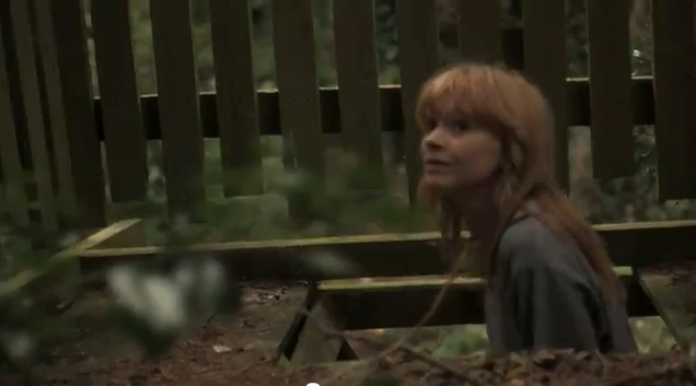
In the music video for Lucy Rose - Scar, the narrative and location, as well as other aspects fit to Andy Goodwins theory. 
For example: 
http://www.youtube.com/watch?v=80yKbjYY1hc


1. Music videos demonstrate genre characteristics/conventions (e.g. stage performance in metal video, dance routine for boy/girl band)


The locations of nature, outdoors and the beach, follow the usual conventions and expectation of an acoustic, indie music video! Appealing to the expected conventions of the target audience. 

2. There is a relationship between lyrics and visuals


As the lyrics say 'blue back to grey' the depth of field switches from focusing on the BLUE fence to the GREY background, rather obvious, but reflects the general mood of the video.


As the lyrics are 'have to leave' 'don't want to go;' all of the shots reflect the artist on her own, in large open spaces, highlighting the lyrics of the song. 


3. There is a relationship between the music and visuals


As the music changes pace, to lively and upbeat, as do the visuals. The scene cuts to outside, and consists of bright colours and bubbles!


4. The demands of the record label will include the need for lots of close ups of the artists and the artist may develop motifs which reoccur across their work (a visual style)
... many different close ups from many different angles.


5. There is frequently reference to notion of looking (screens within screens, telescopes etc and particularly voyeuristic treatment of the female body)  


The way in the which the shot is framed, portrays the effect of the viewer looking upon the artist, who is in her own little world.


6. There is often intertextual reference (to films, tv programmes, other music videos etc)
Although this doesn't really apply the music video that I have chosen, an example of this would be costumes from a particular film or era, or a scene such a car chase. I feel that this convention doesn't apply to this video as Lucy Rose is an 'indie' artist and therefore doesn't follow every music conventions, lol?

Sunday, 29 January 2012

Practicing Light Leaks

Using Final Cut Pro, and the footage that I had from my audition videos, I was able to overlay 'end burns' 'dust scratches' and other effects, simply by adding the short clips over the footage, editing the composition settings to overlay and lowing the opacity. This simple technique allows the footage to be transformed into something much more interesting. Here is the practice example:


http://www.youtube.com/watch?v=b1XBGTWwlu8&feature=youtu.be

As well as this, I have been researching music videos that use a similar technique. This has inspired me to use these effects in my own music videos, allowing it look more professional and interesting.


For Example;
http://www.youtube.com/watch?v=pE2YKq_093U&feature=youtu.be


This music video uses light leaks at the beginning, as well as chosen shots throughout-the simple effects adds to the sunny, acoustic genre.

^ Just a print screen of my auditions, overlayed with light leaks.

Wednesday, 30 November 2011

Practicing 'Move' Sequence

Using the Canon 7D and filming a few clips around school, I've been practising recreating something similar to the 'Move' sequence.
HOWEVER... out of ten different locations, only two of them allowed me to create a convincing continuous walk. This has taught me that, in future, I will need to keep the actress beginning and ending at the same place each time, as well as insuring that they are in the exact middle of the shot, and start walking on the same foot, with the same arms each time!


2ND ATTEMPT.

Making sure that the person in the shot began walking in the exact same place allowed me to add a few more locations.

Update: Although I like this idea and think it would work well, I feel that within the conventions of an 'indie' music video, with a relaxed pace and atmosphere, this would draw away from the target audiences expectations and possible effect how convincing my music video was in my chosen genre. 

Sunday, 20 November 2011

Target Audience

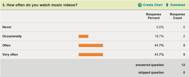
In order to research into potential target audience's for my music video, I created a survey on www.surveymonkey.com to collect informations from potential viewers.
This will inform me of the conventions that may need to be included in my music video, in order to to portray it as a professional video.


http://www.surveymonkey.com/s/XVPNVQR


Results: 


 Overall, it is clear what people expect from an indie music video; the usual conventions consist of locations such a beaches, forests and sand dunes, generally with no narrative though occasionally an easy to follow story. Conventions also include casual, neutral clothing and a relaxed atmosphere. 

This is Loty, she is 18 and I feel that she represents the perfect target audience for my music video. She likes acoustic artists such as  Ben Howard, Bombay Bicycle Club and Lucy Rose. She shops in shops such as Topshop and urban outfitters and spends her free time listening to music, playing guitar and going to the beach with her friends. 


This is a short video interview with Loty about the conventions she expects in an indie music magazine:


Equipment

Using all of the equipment available, I have created a short film practicing with the Canon 7D, the crane, the dolly and the usual tripod. Loty has also filmed me using the equipment.

http://youtu.be/TBTAMMGIhVg


Thursday, 17 November 2011

RICK IS A GREAT GUY

http://vimeo.com/27246366

Rick Mereki:
'3 guys, 44 days, 11 countries, 18 flights, 38 thousand miles, an exploding volcano, 2 cameras and almost a terabyte of footage... all to turn 3 ambitious linear concepts based on movement, learning and food ....into 3 beautiful and hopefully compelling short films.....'


Although I love all 3 short films, 'Move' is my favourite! I would love to use a sequence similar to the film, in a section of my music video. This would entail many locations and very fast pace cuts, but I feel that the final product would be worth it, it is so interesting and would be a very cool time filler.

Wednesday, 2 November 2011

iCal


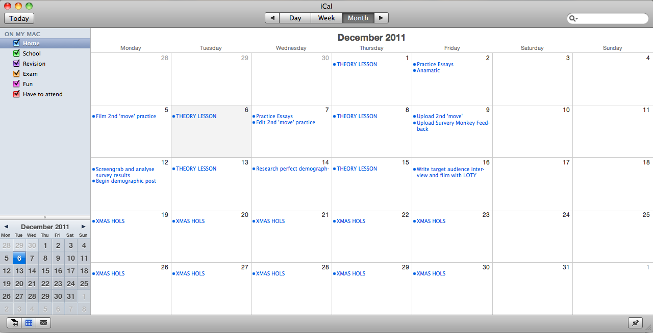
Using the iCal app on my macbook, I was able to create a time plan of the work that needed completing in the month of October. Keeping deadlines and lesson plans in a calendar like this allows me to keep good time management and allow plenty of time for things to get done.


Photoshop Tutorial

Using a Photoshop tutorial, I created the following:

Using Photoshop CS4, I began to follow a tutorial to create a 3D book.
Using the magnetic lasso, I was able to remove the background originally around the book itself, and replace it with the cloudy background, scaling it to fit the image.


Using the quick selection tool, I was able to select just the pages section of the book and delete this.
I was then able to put the grassy imagine in this place, and warp it to make it look more realistic. After this, I created a new layer and used a large brush to add shadows; starting with it black, then lowering the opacity and blending to make them more realistic.
After selecting the section of road that I needed (using the magnetic lasso tool), I copied and pasted it into the book image. Using the warp and scale tools, I was able to add depth to the image and make the road look more realistic. I also added shadows using a large black brush, highlights and burns tool, in the right places to match the background.
After cropping trees, and editing the layer and removing any remaining white, I was able to add them to the book and make them look in place by flipping them, and adding various shadows.
Again, using the burns tool and highlighting and using the large brush, I have attempted to make the image look more realistic.


This photoshop tutorial has taught me the many options and effects available, hopefully allowing me to create more interesting and eye catching digipacks and posters.

 Messing around on photoshop, I created a Hockney style imagine of Elli Goulding... If I were to improve this cover then I feel that it would contribute to an interesting digipack.